For the past 26 years, Pantone has been selecting a color to set the tone for the year. Here is an exploration of the Color of the Year program and this year’s color.
By Jayne Turner – Staff Writer
Pantone has been defining the universal language color since 1963. With their innovative color-matching system, accurate and consistent color selection is available in all color-conscious industries. Beauty, fashion, and interior design all rely on Pantone.
What began with just 500 colors has evolved into sets of thousands across various sorting systems tailored to different industries.
History of Pantone Color of the Year
In 1999, Pantone introduced the Color of the Year program to spark discussions among industry experts and color enthusiasts about color.
How is it decided? By a global team of color experts, of course! They search far and wide for color influences. Anything and everything that takes place in our culture over the year can influence the chosen color. Trends are considered. It’s all very scientific, really.
The color is chosen for its universal relevance. No one region or sector of design is chosen over others. The color experts note that it serves as an expression of the part of all consumers worldwide. This is a HUGE task!
They emphasize the difference between a short-lived fad, like a trending color in fashion, and a lifestyle trend, like the color of the year.
Read more in this interview with the Vice President of the Pantone Color Institute.
The Impact of Color
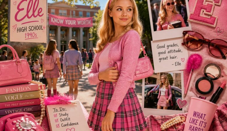
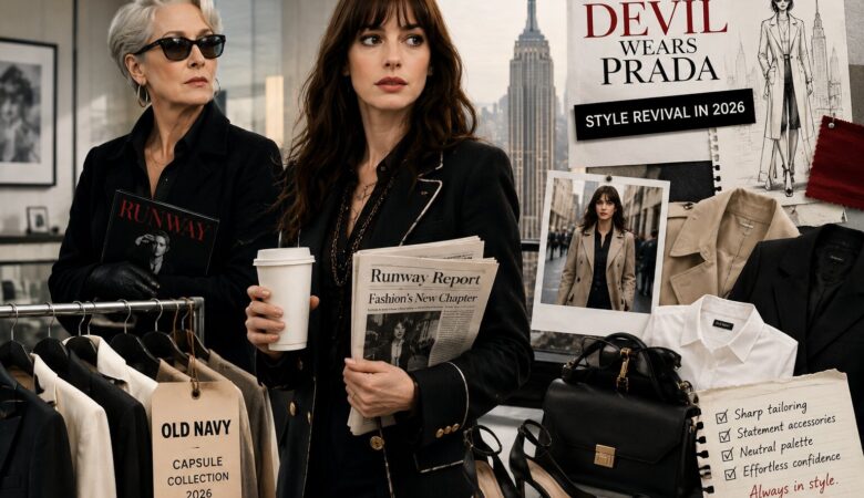
Color profoundly impacts human behavior and perception. The psychology of color has been widely studied in marketing, with different colors affecting buyer behavior. The color that a brand associates with evokes different feelings in the consumer. For example, red is exciting, purple is wise, yellow is joy, and green is nature and abundance. Though everyone has their own favorite color, researchers have found legitimate differences in perception depending on color.
So, selecting a color to represent a whole year is not so simple.
See also: How to Succeed in Online Classes
The Color of 2026
This year, Pantone selected a color that is “a whisper on tranquility and peace in a noisy world,” PANTONE 11-4201 Cloud Dancer. A lofty white symbolizes a calming influence on a society rediscovering the value of quiet reflection.
The blank slate allows for true relaxation and focus. A blank canvas for creativity.
Complementary color palettes include powdered pastels, light and shadow combinations, and tropical tonalities. Check out the rest of them here.
With near-endless color possibilities, Cloud Dancer is not just a color, but a mindset. Pantone suggests using it in your morning ritual, creative flow, and everyday calm.
Fun Products
Every year, multiple brands come out with their products in the desired color. This year, there’s Play-Doh, sheets by JOYBIRD, Post-it Notes, and even Command strips!
Explore: Do You Need a Silk Pillowcase?
Is this year’s color not your style? Check out any of Pantone’s selected colors from 1999 to present to find your favorite.
—
Author: Jayne Turner is a freelance writer from Los Angeles, California. She has a bachelor’s degree in Neuroscience with an emphasis on language and cognition. She has ten years of musical theatre experience and a lifelong love of reading. Utterly excited by the brain, she brings a fresh Gen Z perspective to the topics that intrigue us most.